
Nail Addict
From local salon to polished brand identity.
Building Nail Addict’s first brand system: a polished look rooted in Parisian style.
The Inspiration
The salon’s exterior warm tones and airy interior set the tone: a blend of chic modernity and intimate comfort. We wanted the identity to echo that balance; polished yet approachable.
The brand should feel as elegant as a French manicure — refined, timeless, and inviting.
- Eva Assouline-Barsimanto, Nail Addict


The Challenge
Launching in Paris meant standing out in a market where style and presentation are everything. The brand needed to feel effortlessly chic, appeal to trend-savvy clients, and translate seamlessly across signage, packaging, and digital platforms.
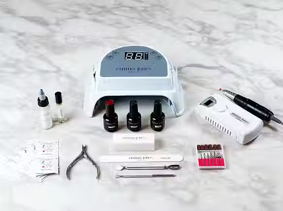
As the salon grew, so did the challenge. The founder expanded into new ventures, including Emma Jones DIY shellac kits and additional product lines. Each needed its own identity and packaging that felt fresh yet connected to the original Nail Addict brand.


The Approach
We explored multiple directions, balancing sophistication with approachability. Early concepts tested typography, floral motifs, and brand architecture between Nail Addict and its founder label Emma Jones Paris.
We built the new identity around three pillars:
-
Elegance: Clean typography and refined layouts.
-
Consistency: A visual system spanning signage, print, and digital.
-
Warmth: Floral motifs and soft palettes to echo the salon’s inviting atmosphere.


A cohesive identity, built for trust.
The Result

What began as one salon identity grew into a creative partnership spanning more than a decade. Nail Addict evolved from a single salon into a multi-faceted beauty brand with multiple product lines and a strong visual presence.
For me, this project marked a defining milestone. The first time I saw design extend beyond the page to shape how a business looks, feels, and connects with its audience.


